Creating a simple, but friendly learning platform
OVERVIEW
For this practice UX case study, I took on the role of product designer for Lernly, a new online learning platform aimed at helping creative professionals level up their skills through short-form, high-impact courses.
ROLE
User Research, Visual design, Prototyping
April 2025
The context
Lernly was imagined as a fresh alternative to platforms like Skillshare and Udemy, one that prioritizes not just the quality of content, but also the flow of the learning experience itself. The platform focuses on creative and tech fields like illustration, animation, programming, and UI design, with each course broken down into bite-sized lessons that mix video and written material.
The Problem
The challenge was to make the experience smooth, engaging, and easy to follow — especially for users who might binge several lessons in one sitting.
The Goal
The goal was to create a high-fidelity digital prototype that would simulate the final product’s feel, focusing on interaction design, UI components, typography, and overall visual quality of the course screen. I also added interactivity to help stakeholders and users visualize what using Lernly might actually be like.
Competitive Research
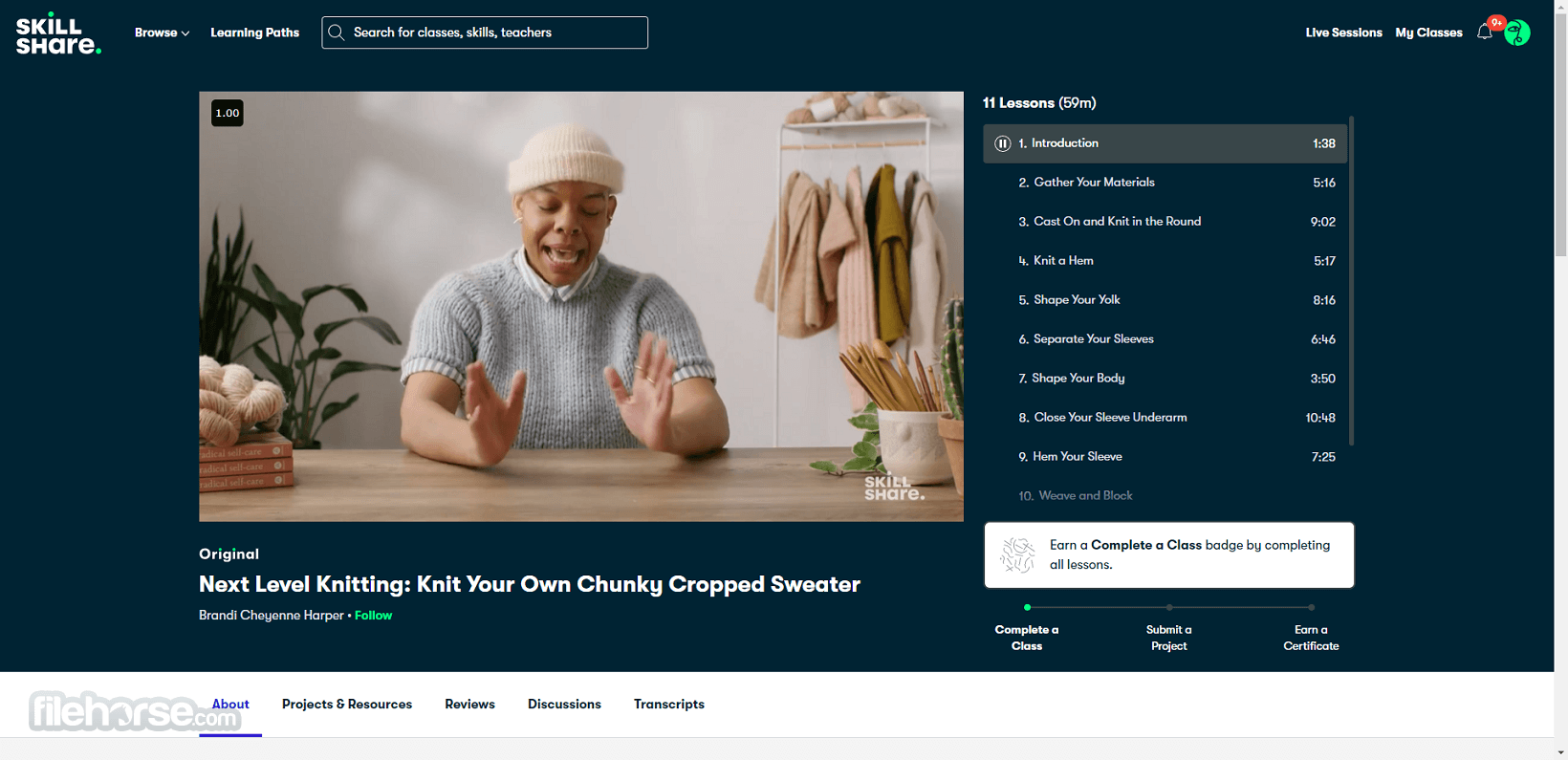
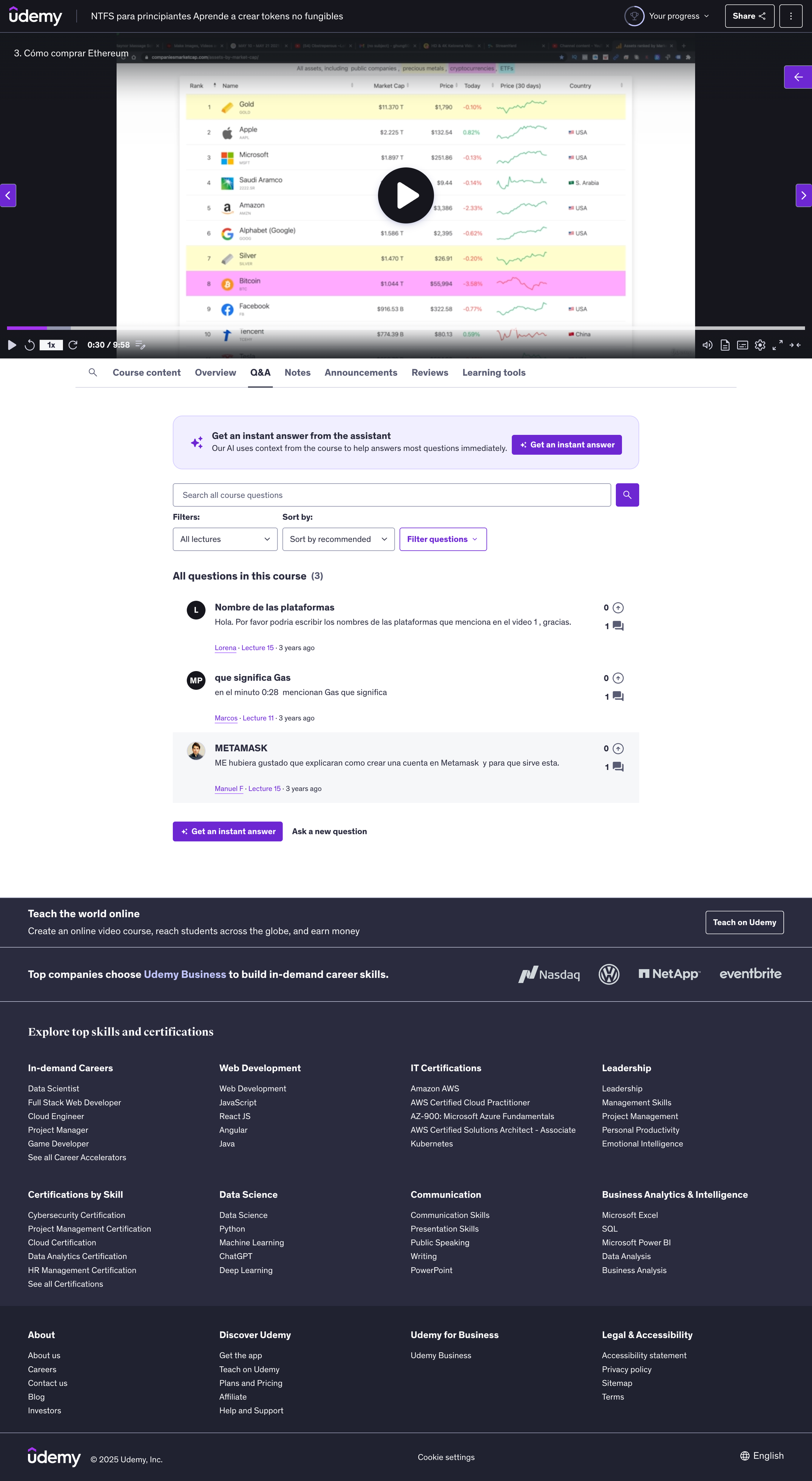
To understand what users expect and how other platforms do it, I analyzed Skillshare and Udemy—two leaders in online learning. They each handle layout, content, and engagement differently.
What I Looked At
Course layout & lesson flow
Video + text integration
Progress tracking
Visual hierarchy & readability
Mobile experience
User tools (notes, comments, discussions)
+ Simple, creative-friendly UI
+ Autoplay keeps lessons flowing
+ Course outline always visible
– Very little interaction per lesson
– Shallow lesson pages
– Few feedback options
+ Clear structure and tracking
+ Note-taking and bookmarks
+ Lots of tools for instructors
– Interface can feel cluttered
– Constant upselling
– Lessons feel too segmented
Main Pain Points Identified
Choppy Learning Flow
Too many clicks and slow transitions break user focus.Low In-Lesson Engagement
Few built-in tools for quick notes or bookmarks.Busy, Overwhelming Layouts
Especially hard on new or less techy users.No Personalization
Platforms don’t adapt to individual learning progress.Video/Text Imbalance
Some rely too much on video without clear, scannable written content.
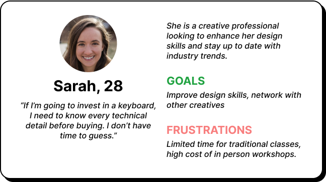
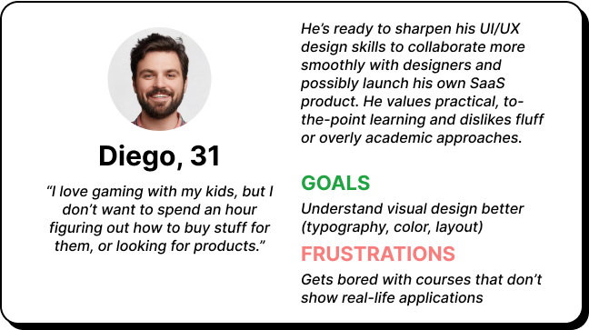
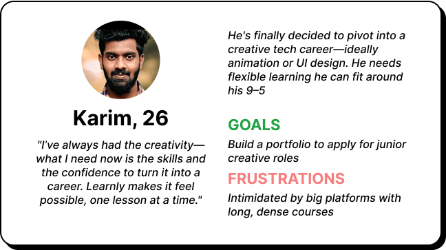
Who was i designing for?
Designing the structure
I created a user flow to visualize how a learner would navigate through a course on Lernly, from starting or resuming a course to completing the final lesson. This helped identify the essential screens and key interactions for a smooth, focused learning experience.
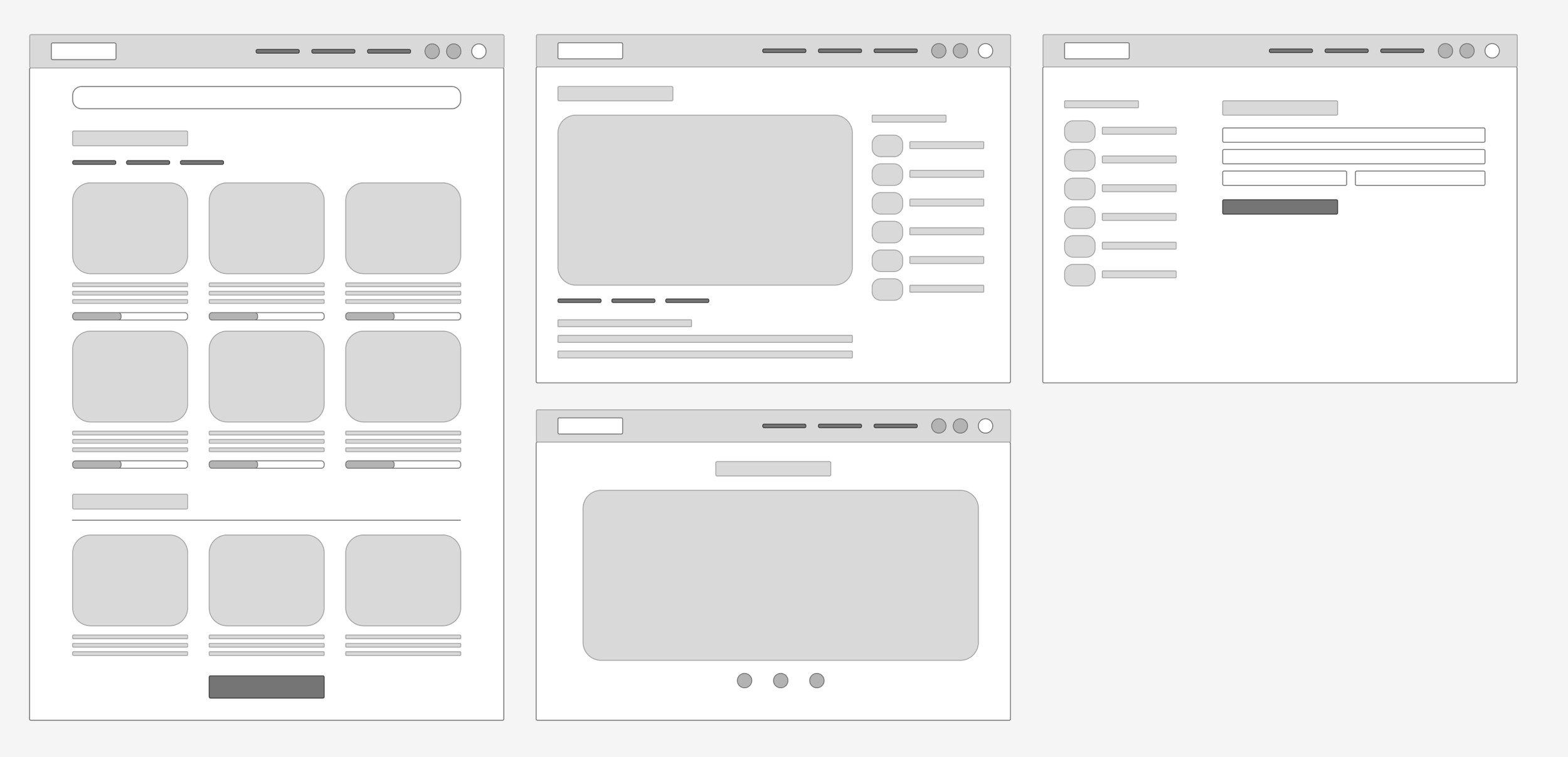
Wireframing
After some quick sketches where I explored layout options, I chose the one I found most functional and moved on to digital wireframes. This helped me define a cleaner, more lightweight structure for the site. Since this is a practical case study, I focused solely on the desktop version of the prototype.
The prototype
After finalizing the structure through wireframes, I moved on to the high-fidelity prototype, aiming for a clean, minimal interface that supports focus and ease of use. I refined the layout, typography, and components to create a smooth course flow. Since this is a practical case study, I focused solely on the desktop version of the prototype.
Take aways
I learned a lot about how people actually use online learning platforms.
One of the biggest takeaways was how important it is to make the transitions between lessons feel smooth. Reducing friction here really helps keep users focused.
As someone who also uses these platforms, I noticed how helpful little extras, like being able to take notes right on the video can be. Those small features make a big difference.
I also realized how key it is to keep the interface clear and simple. It’s easy to overdo it and end up with a cluttered screen, but clear visual cues and easy navigation are what really help users.
In this project specifically, I understood how important it is to visualize the user flow properly, to really map out how people will move through the app and what they’ll need at each step.
At the end of the day, users want a clean, simple experience, but without sacrificing access to all the important tools and info they need.


