
Redesigning an E-commerce to create a better & simpler experience
OVERVIEW
As part of my User Experience certification program, I chose to redesign a website from a user experience point of view.
I focused on MaxGaming, an online store specializing in gaming gear.
My goal was to go through the complete design cycle while improving a site related to one of my passions, gaming.
ROLE
User Research, Visual design, Prototyping
April 2025
The Problem
MaxGaming’s site had confusing navigation, cluttered visuals, and unclear product info, causing frustration and loss of trust during checkout.
The Goal
Redesign the platform to improve the shopping experience by focusing on product organization, clearer technical details, and a visual identity that better reflects gaming culture and style.
The Research
I conducted secondary research through online reviews, site structure analysis, and benchmarking similar stores. Initially, I assumed the main issue was visual, but research showed users struggled more with navigation, product clarity, and trust in the checkout process. This helped me finding the pain points the platform presents for the users:

Pain Points
The research revealed several key pain points commonly shared by users. These issues had a direct impact on the overall navigation experience of the website.
Filters are confusing and don’t help narrow down searches.
Visual hierarchy is cluttered and overwhelming.
Technical information is unclear for less experienced users.
Checkout is lengthy and lacks clear feedback or confirmation.
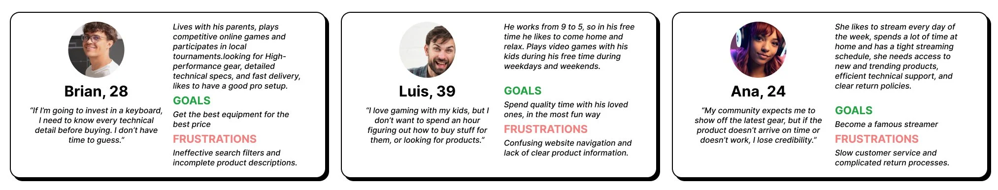
To guide the redesign, I created three user personas based on research insights. Each represents a key audience segment with distinct goals, behaviors, and frustrations when shopping for gaming products online.
Re-designing the structure
With the pain points and personas in mind, I created a user journey map to better understand the experience from their perspective. After empathizing with their struggles, I started mapping out the user flow to identify where the experience could be improved, aiming for a more seamless and intuitive path through the website.
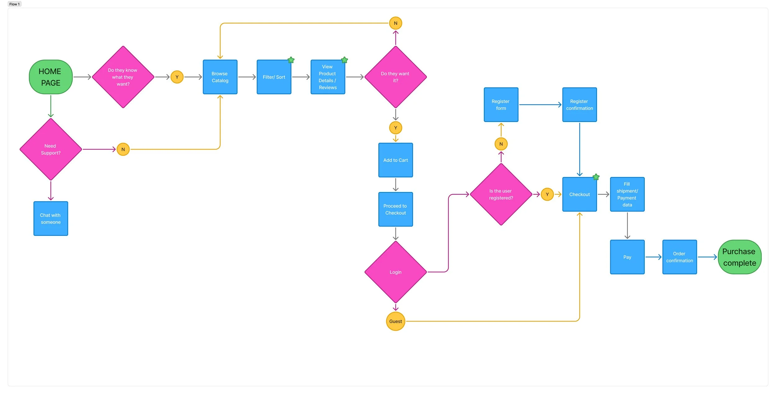
As I went deeper, I realized I wanted to focus on specific problem areas by pinpointing them along the user flow and addressing them step by step. This helped me identify a few key areas to work on:
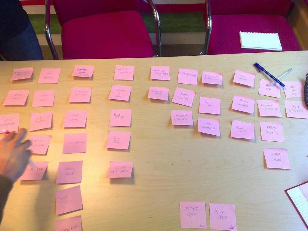
To help reorganize the information on the website, I ran a small card-sorting exercise with a group of people whose profiles closely matched the user personas.
Product filters and categorization needed to be simpler. My goal was to reorganize the large inventory into clearer categories and prioritize the products users are most interested in.
Product display felt cluttered. There was no visual hierarchy, and everything blended together. I wanted to establish visual priority so important items stood out.
Product information was often too dense or disorganized. I aimed to simplify the way details were presented, making it easier for anyone to quickly understand what they’re buying.
Checkout and post-purchase support needed to be straightforward and trustworthy. I focused on making the payment process feel secure and intuitive, while also including a clear support system for after the purchase.
The ideas
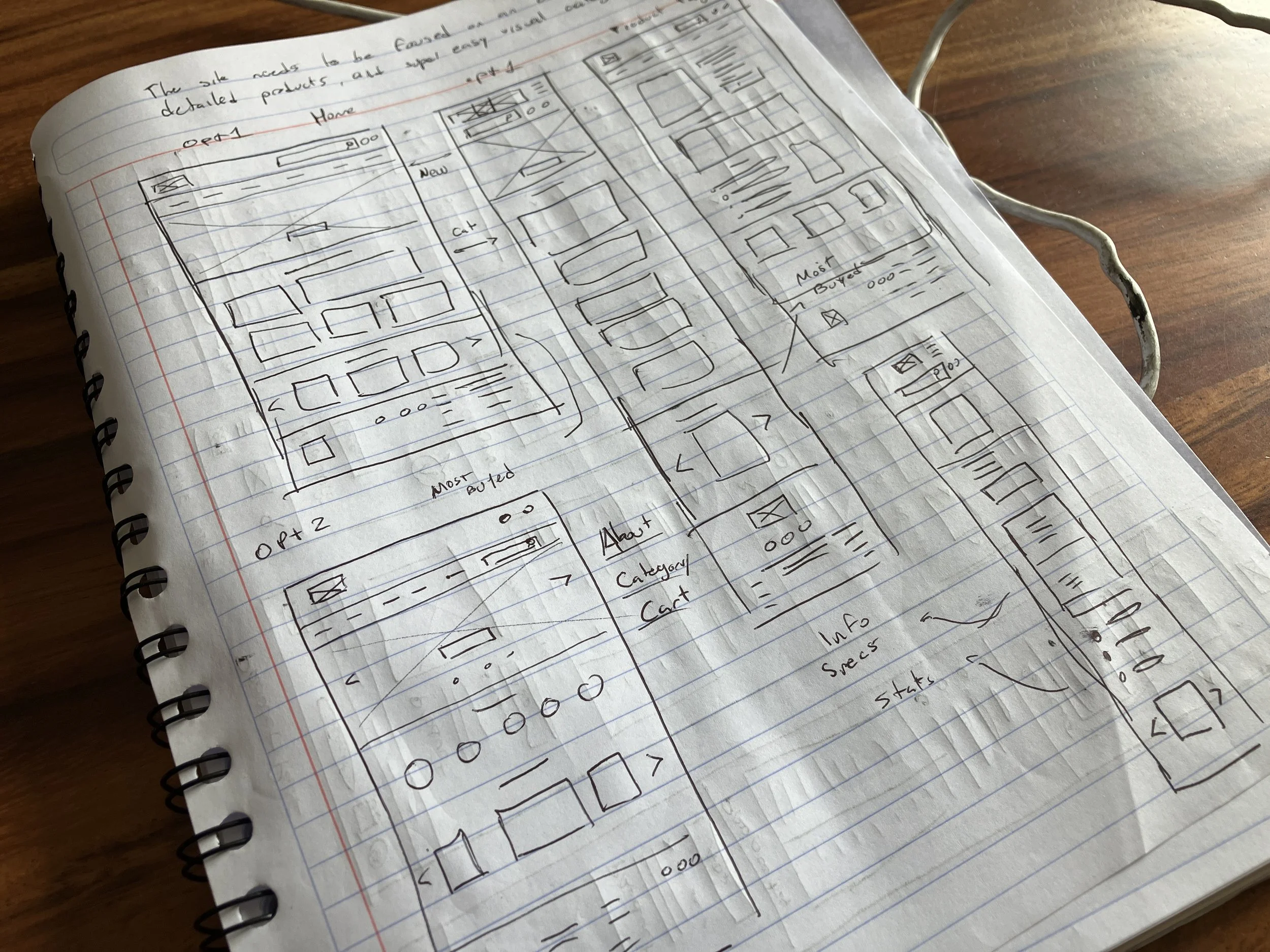
I decided to run a quick Crazy 8 exercise to come up with some fresh ideas on how I could rearrange and redesign the way the information is presented. I moved on to some mid- fiddelity wireframes to explore the structure and test out a few of the ideas I picked from the sketches. Those that I felt addressed some of the key problems uncovered during research.
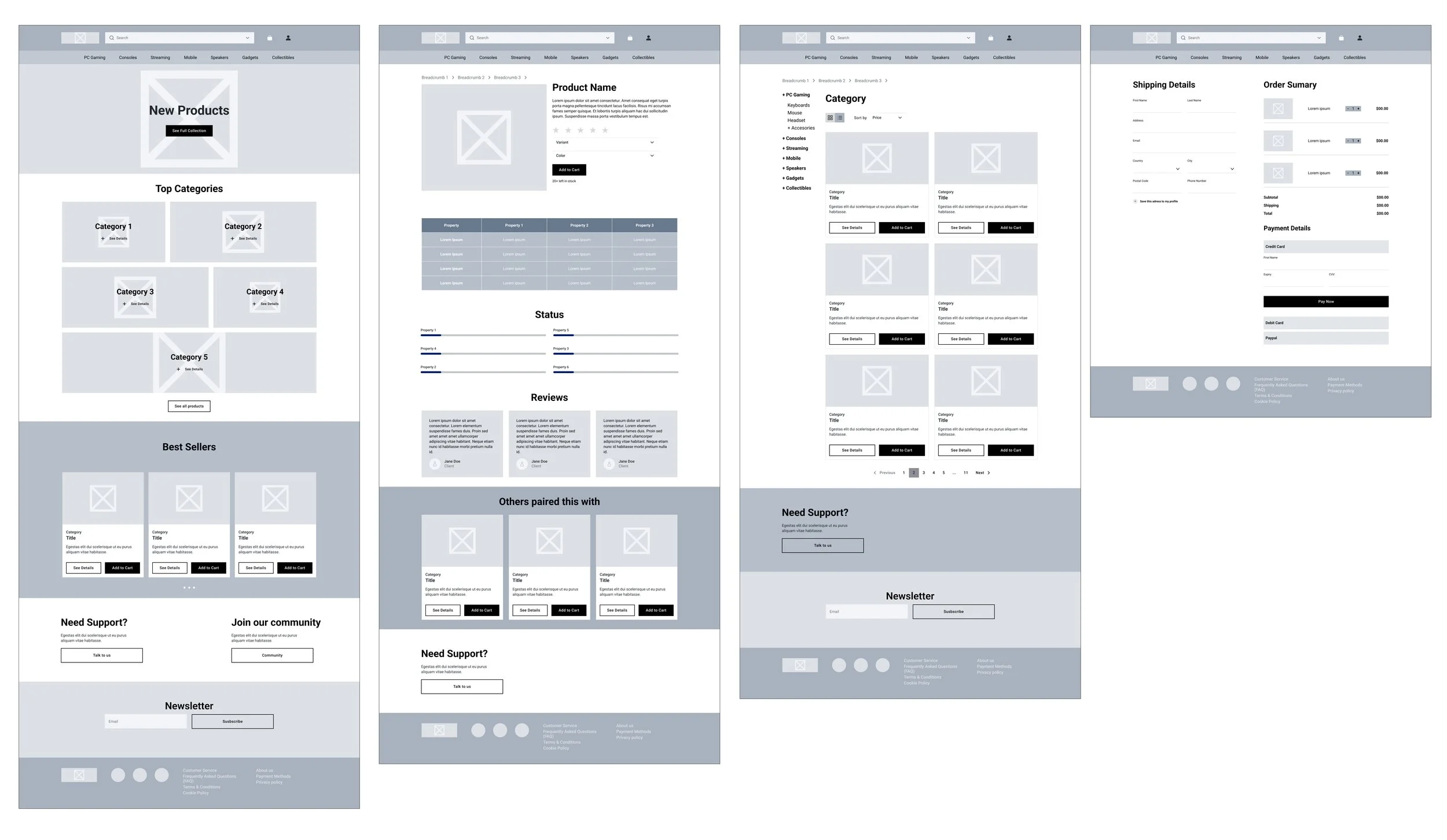
The same group of people who helped with the card-sorting exercise also tested the wireframes through visual navigation. They gave me some unexpected feedback—some elements, like the buttons on the product cards, were too distracting, the categories on the home screen felt confusing, and there was a noticeable lack of product recommendations. Based on that, I made a first round of iterations to the wireframes and tested them again with the same group. Once I had their approval, I moved on to creating the high-fidelity prototype.
The prototype
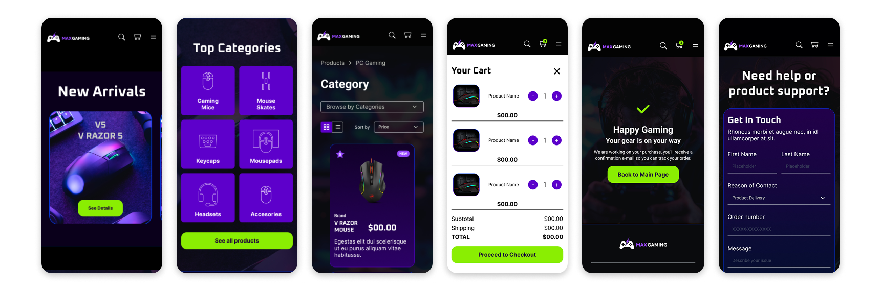
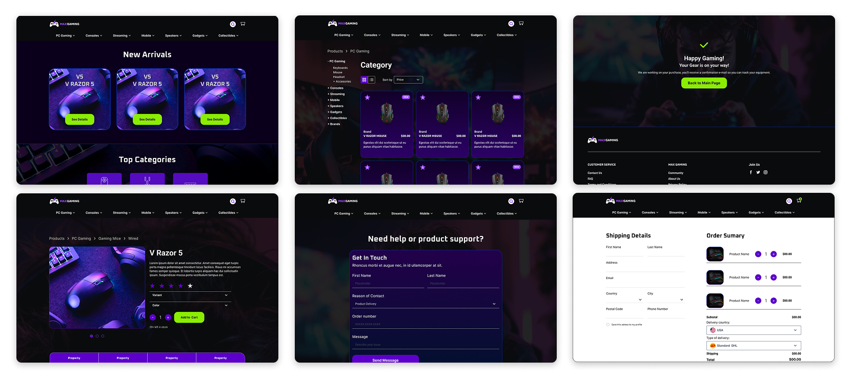
With the wireframes ready, I began the redesign with a mobile-first approach, ensuring the site would look great on any device. I selected a color scheme that resonates with the target audience and focused on keeping navigation visually clean and intuitive. Based on the research, I knew I had to focus on key aspects like clear product information, strong visual hierarchy, a simplified checkout process, and making support and contact options more accessible. The main design goal was to maintain simplicity in the overall experience. Here are some of the screens.
Take aways
User feedback is key. Sharing the prototypes with the same people who helped during the research gave me valuable input and pushed the project through several helpful iterations.
Know when to stop. Since it was a personal project, I chose to wrap it up after a few rounds of feedback and move on to new learning opportunities. It was more about the process than the final product.
Respect the process. I learned not to rush into design tools too early. Spending more time on research and sketching helped me solve design challenges more thoughtfully.
Designing for diverse audiences is a real test. The gaming community is broad and varied, which made it a fun but complex challenge to create something to address different users, keeping the design visually clear.
This project was a solid learning experience. It gave me the chance to go through a full redesign focused on UX from start to finish, and that’s something I’m proud of.