Redesigning a transportation app to simplify the experience
OVERVIEW
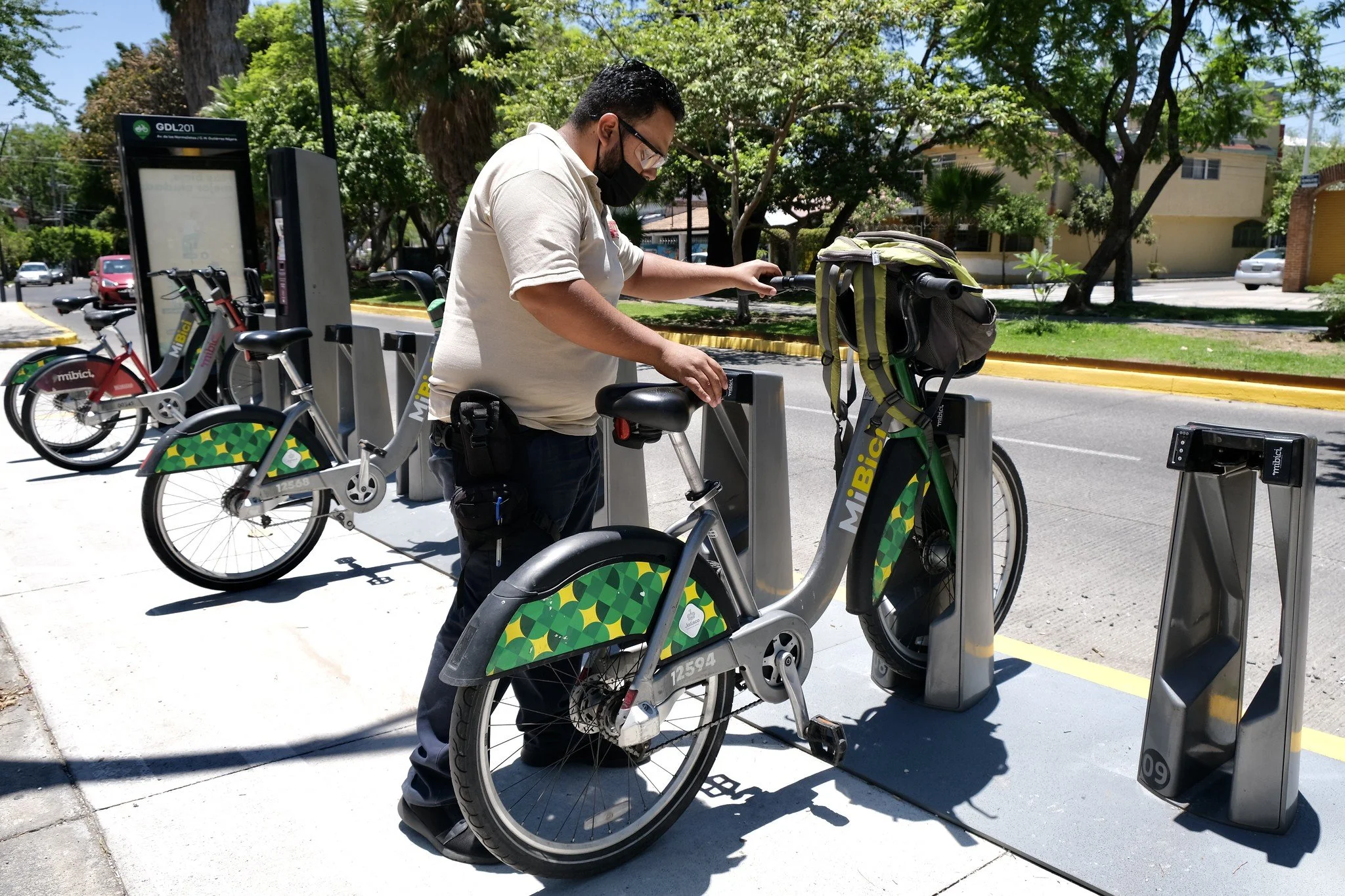
In Guadalajara, getting around on a bike is easier thanks to MiBici, the city’s public bike system. I’ve used it plenty of times — you grab a bike from one station, ride across town, and drop it off at another. Simple… in theory.
The problem? The app isn’t exactly your best riding companion. From confusing flows to unreliable features, it often makes a smooth ride feel bumpy. That’s why I decided to take a closer look at it from a UX perspective. My goal was to rethink the experience, fix its pain points, and design something that truly supports the way people use MiBici every day.
ROLE
User Research, Visual design, Prototyping
June 2025
A little intro…
When I moved to Guadalajara, MiBici quickly became part of my daily routine. It’s practical, affordable, and sustainable. But after a few months of use, I realized the app wasn’t always on par with the physical service. A couple of failed unlocks, a payment that didn’t go through on the first try, and more than a few times feeling that strange anxiety when returning a bike (“Did it lock properly, or am I about to get charged extra?”) made me think: this could be so much friendlier.
That’s how this personal project was born:
Redesigning the app with a stronger UX approach, using a structured framework but keeping a human touch.
The Problem
MiBici’s current mobile app suffers from usability issues such as unreliable payment processing, confusing navigation, and scattered essential information. These friction points reduce user trust, increase frustration, and discourage consistent use of the bike-sharing service.
The Goal
Redesign the MiBici mobile app to create a more intuitive, reliable, and user-friendly experience by streamlining payment and registration, consolidating key information, and reducing friction in core tasks, ultimately increasing user trust, satisfaction, and service adoption.
Starting out
My starting point was to experience the service as any user would. I used the app in different situations:
A Monday morning in a rush to get somewhere.
A relaxed Sunday ride through Chapultepec.
Under the midday sun, and also with my phone battery at 15%.
At the same time, I spoke with other users who just use it to get from point A to point B without paying for a taxi. Everyone had something to say, and many complaints were repeated. These are some of the screens you can currenlty find in the app.
I wanted to know if my experience was unique or a common pattern, so I interviewed both frequent and occasional users. I also checked app reviews on the App Store and Google Play.
Key findings:
People complain the app is slow and unintuitive.
Many don’t immediately understand how to start a trip.
Confusion around the bike/space availability system.
Several prefer finding stations on Google Maps because it’s faster.

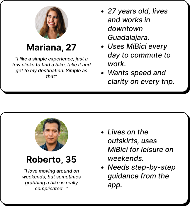
Who uses the app and what do they want?
From the research, I identified two main user personas, and some of the main pain points repeated during the interviews.
Cluttered interface.
Poorly functional maps.
Lack of real-time information.
Unnecessary steps for common actions.
Starting the idea
With the information ready, I wanted to make a clear user flow to better understand the user’s actions and process through the app. With this is mind it became easier to identify the elements and screens needed to make a user friendly design.
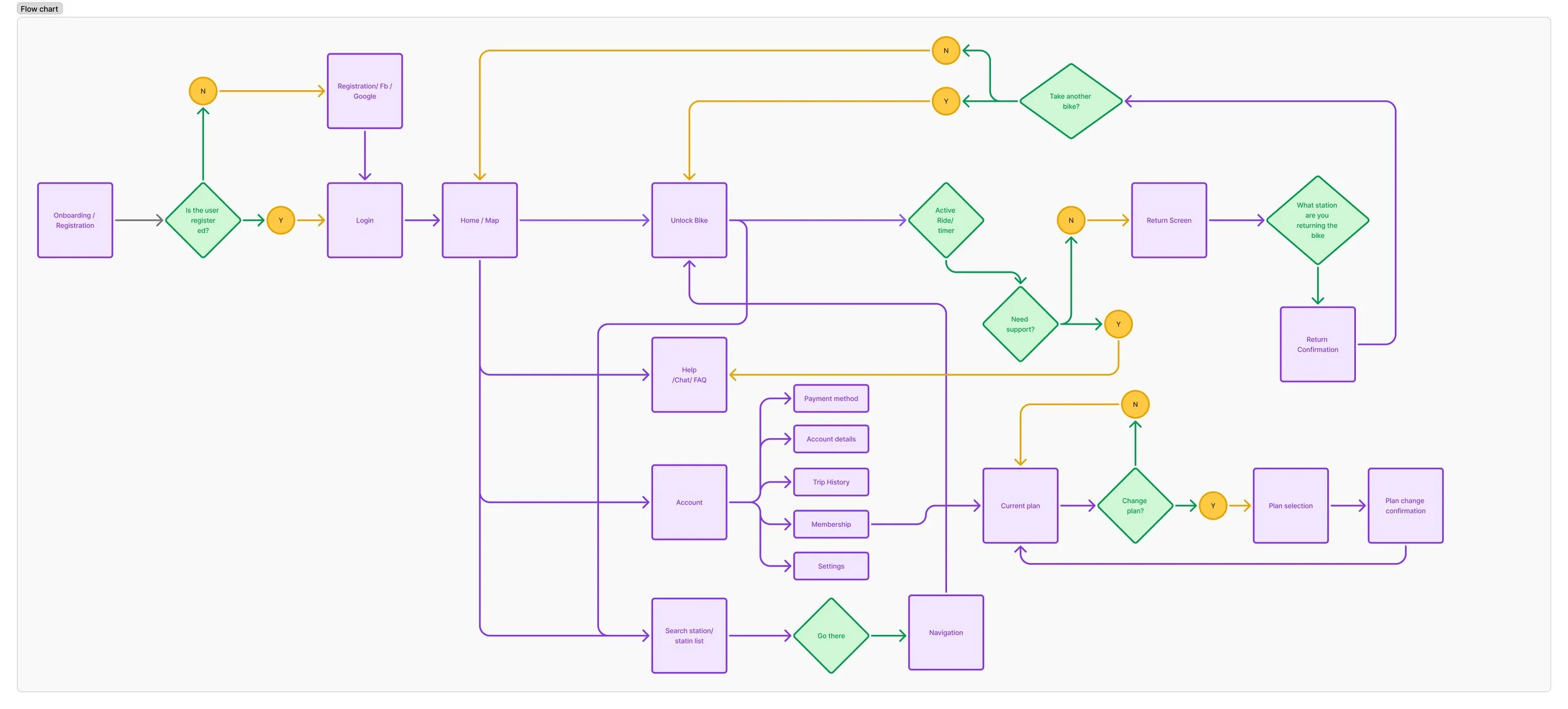
With the problem well-defined, I began sketching possible improvements:
Map as the main screen, showing real-time bike and dock availability.
Clear availability indicators (colors and large numbers).
Simplified rental/return flow with confirmation screens.
Better integration of trip information and account status.

Designing the app
I moved from paper sketches to a low fidelity prototype in Figma to test layout and flows in a quick way. I wanted to create a fast view of the overall experiece so the wireframes are not super detailed and designed.
This made easier to understand if the screens and flow worked the way i wanted.You can see the wireframe prototype here.

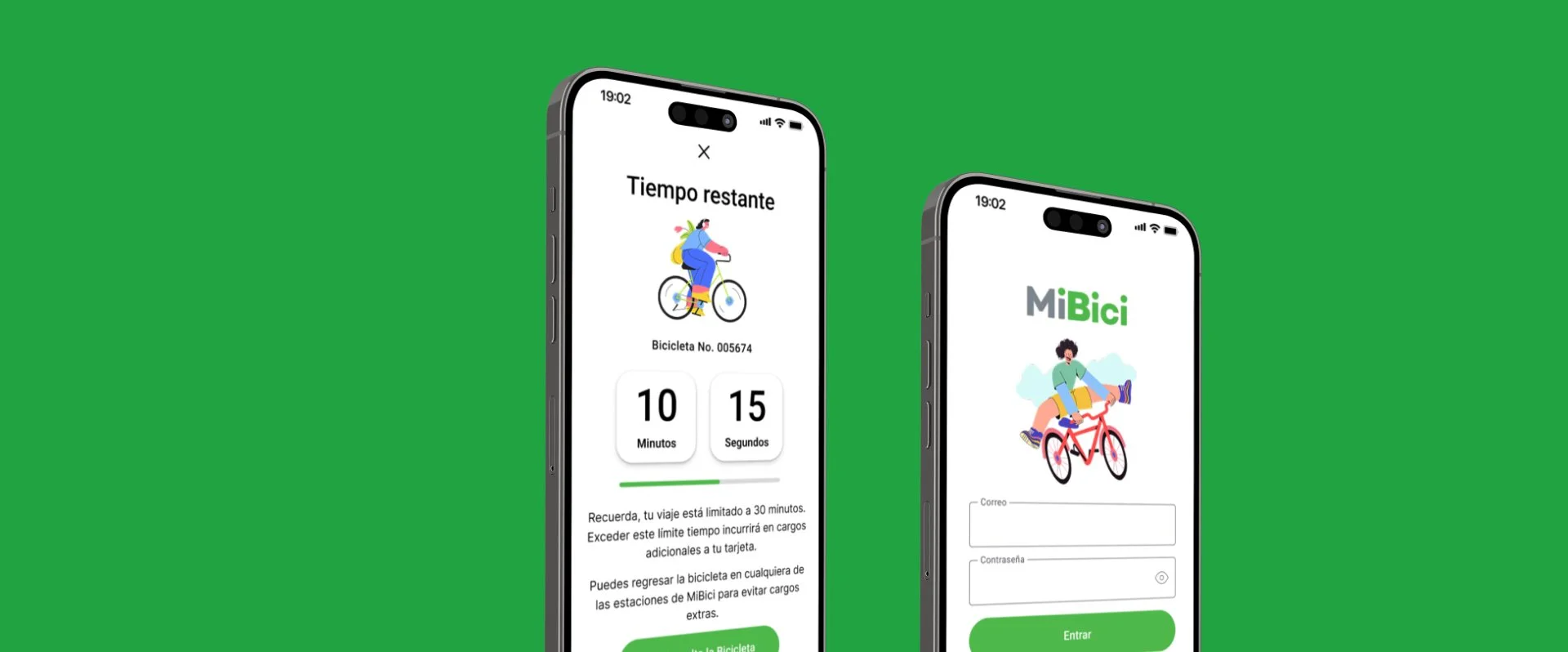
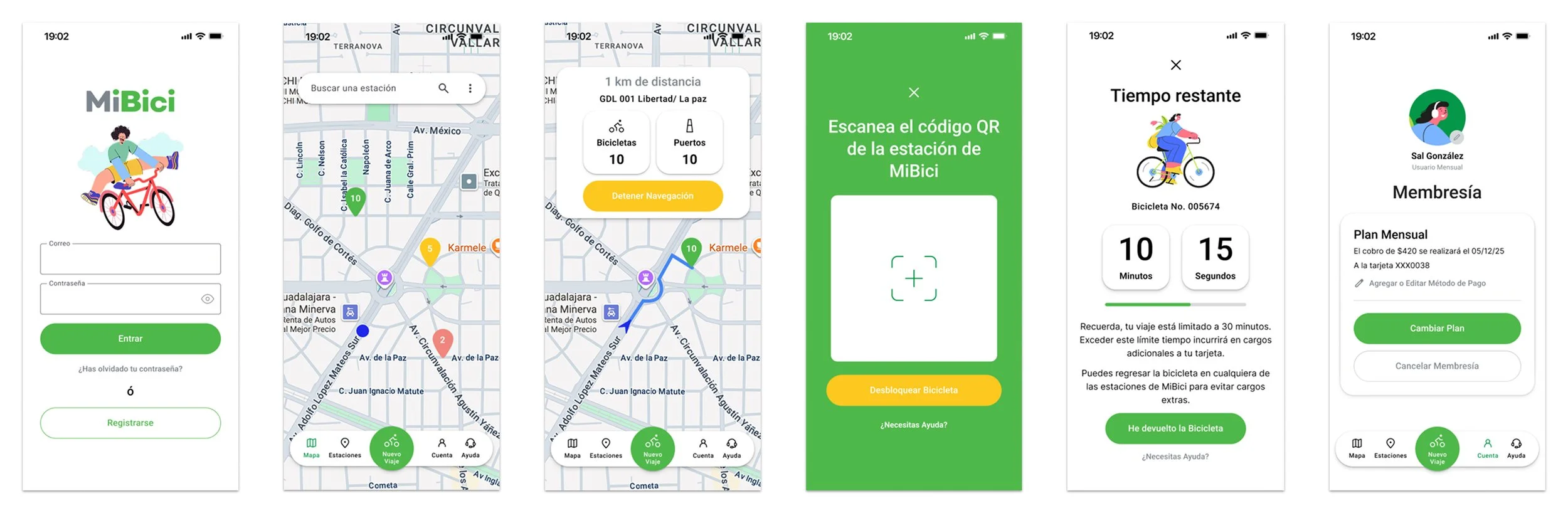
Finally I created high-fidelity prototypes with a cleaner design, clear iconography, and colors that convey security and ease of use.
These are some of the Key changes i made:
Main screen centered on the map.
Floating action buttons to start a trip or scan a QR code.
Visible availability at each station with color codes.
History and balance section accessible in one tap.
Take aways
After sharing the redesign with some acquaintances who regularly use MiBici, I received encouraging feedback. They noticed clear improvements in both the flow and the overall design, which reassured me that simplifying the core tasks was the right direction.
Redesigning the MiBici app was more than just a design exercise for me — it was a way to understand how digital products can directly impact everyday experiences in the city. By focusing on the real frustrations users face, I was able to simplify the flow of the app and bring more confidence to key interactions like unlocking, paying, and returning a bike.
One of my main learnings was that even small changes, like clear confirmation messages, can reduce user anxiety and create trust in the service. Streamlining registration and payment showed me how essential it is to remove friction at the very start of the experience, because if people can’t join easily, they won’t use the system at all.
I also realized that while visual improvements make the app more pleasant, what truly matters is addressing the moments where users feel stuck, unsure, or anxious. That’s where design proves its value.