Creating a design system to improve brand consistency and usability
OVERVIEW
Aceromex is a company working in the steel industry in Mexico. With a wide range of products and services, they cater to clients in construction, manufacturing, and infrastructure. Their team is large, distributed across multiple regions, and relies heavily on digital tools both internally and externally.
ROLE
Visual Design
June 2025 - Current
The Problem
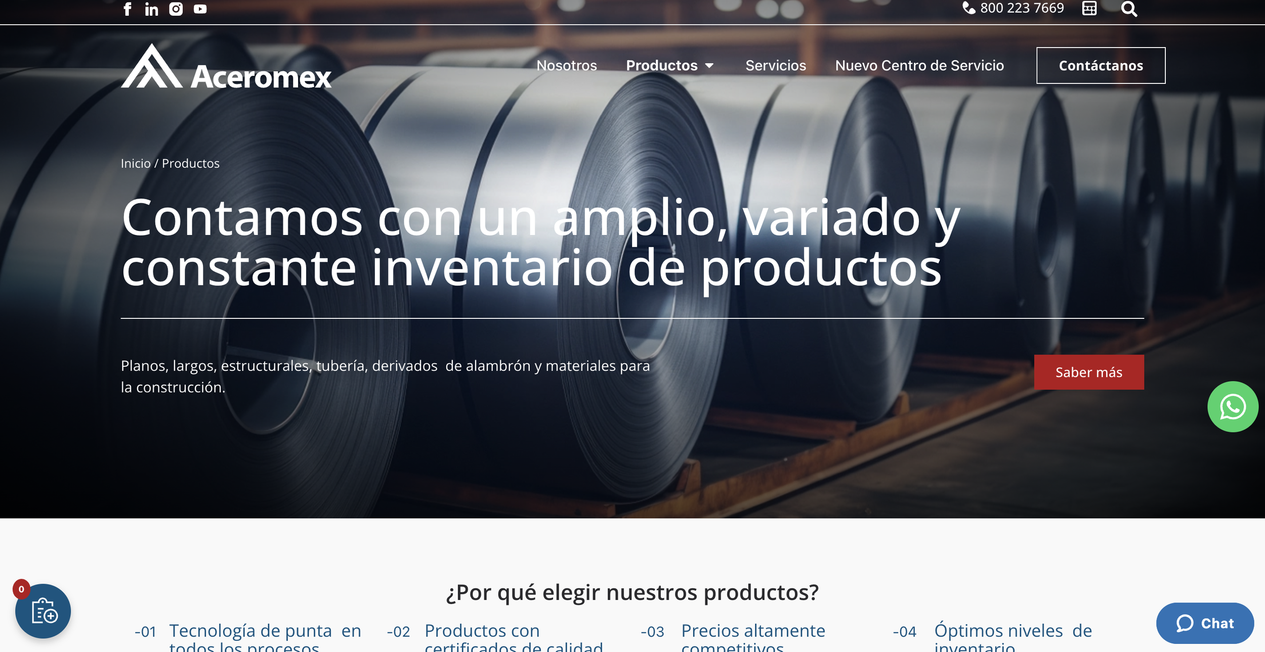
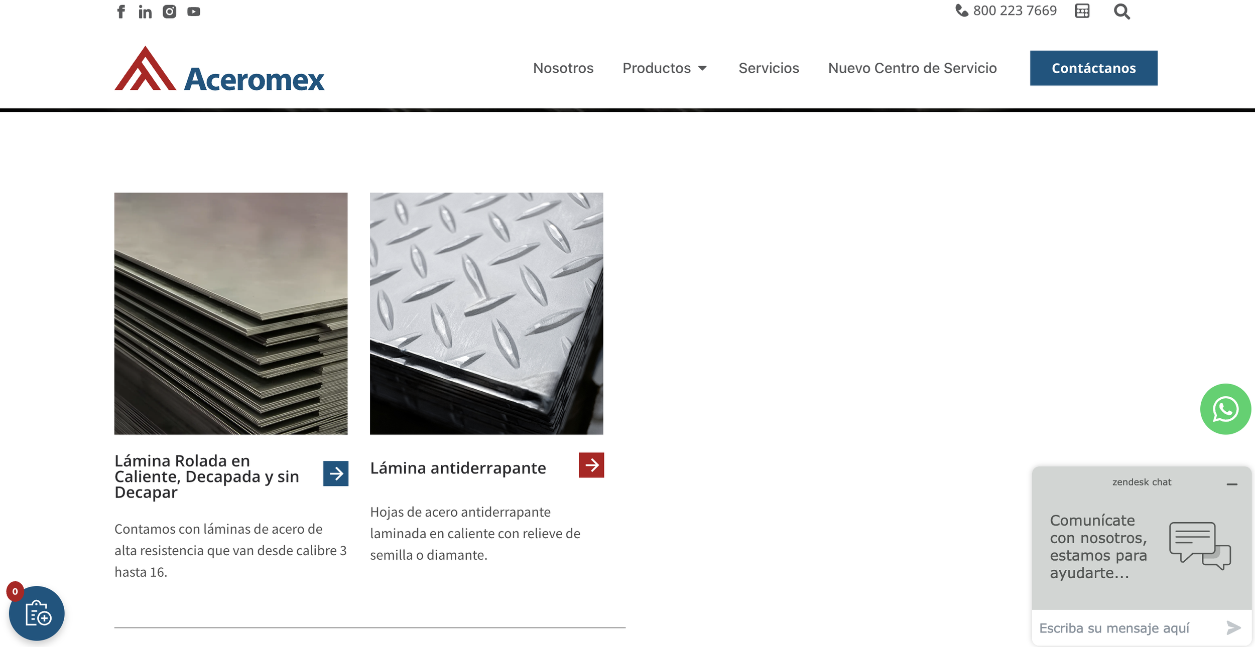
When they reached out, their website was live but lacked visual consistency. Internally, different teams were using different styles and patterns when building tools for their intranet.
As a part of the company rebranding, my job was to design a unified design system that would serve both environments. This is the first stage of this project.
The Goal
The main goals of this project were to:
Bring visual and functional consistency to both the public site and internal platforms.
Define a reusable system of components that could scale over time.
Improve collaboration between designers and developers with clear UI rules.
Create documentation that allowed non designers (PMs, marketers) to use components confidently.
The Research
I started by doing a deep dive into Aceromex's live website. The first part of this research was just auditing and documenting everything that already existed visually and functionally. No reinventing the wheel, just understanding what they had.
What I did:
Explored and mapped the UI patterns used across their pages.
Identified inconsistencies in buttons, font sizes, icon styles, layout spacing, etc.
Created a comprehensive inventory of components being used.
Analyzed the user flows and how navigation behaved across devices.
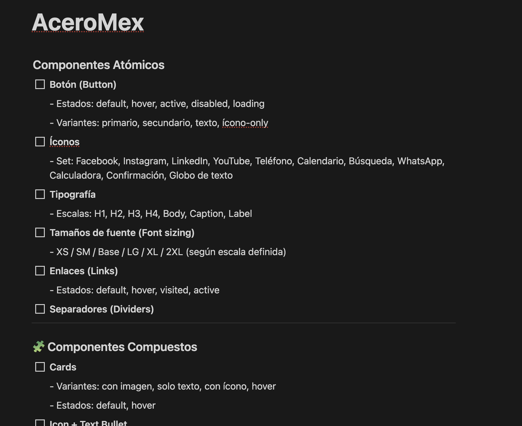
This initial audit helped me create a full list of design elements in Notion to normalize, group, and systematize later. Everything from icons to floating cards to chat widgets made it onto the list.
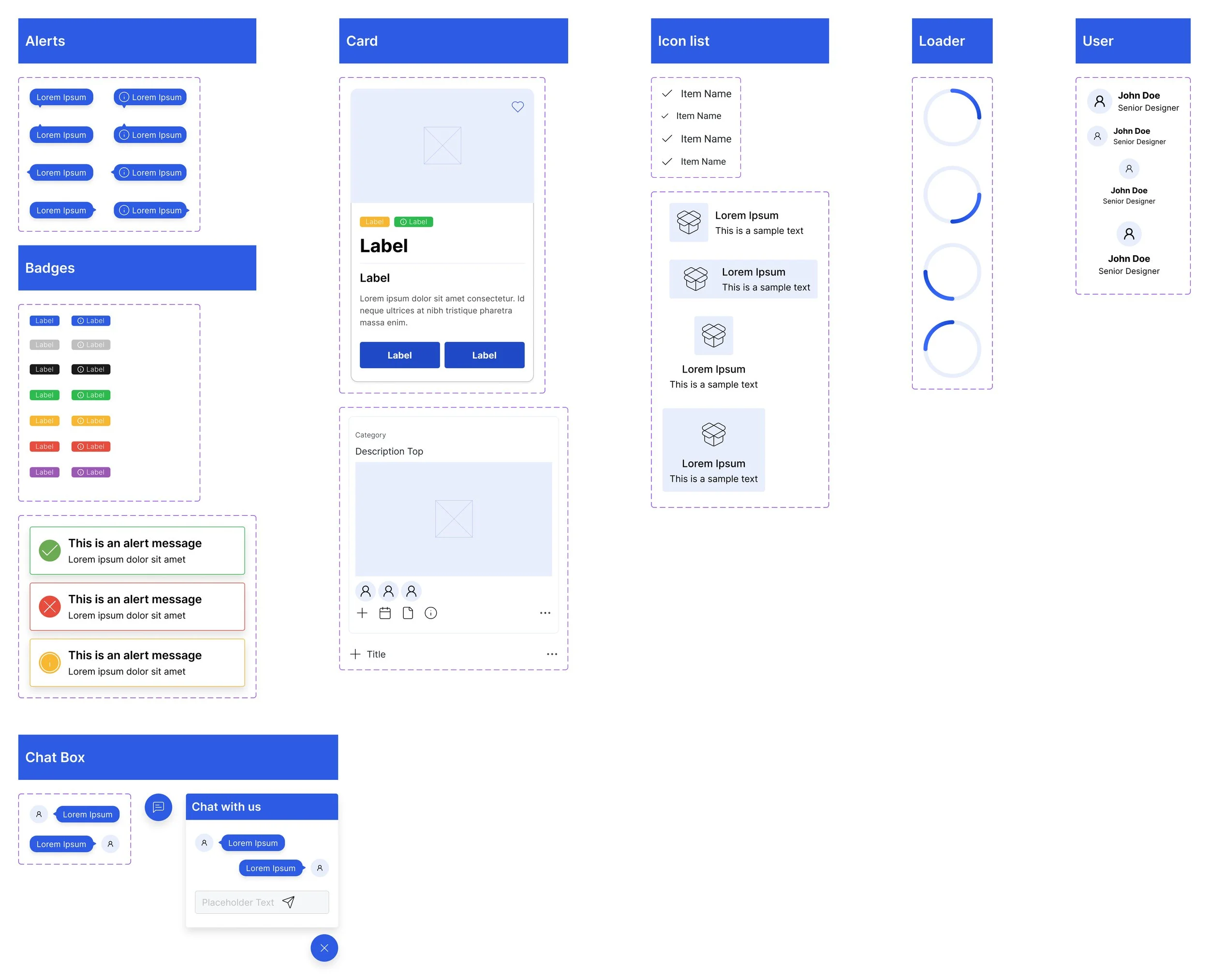
Once the inventory was done, I organized the design system into clear categories. I built it using a modular approach, starting with atomic components and moving into more complex combinations.
Atomic Components: buttons, links, icons, inputs, headings, etc.
Composite Components: cards, dropdowns, chat box, modals, tables, etc.
Navigation Components: navbars, sidebars, breadcrumbs, arrows
Feedback Components: toasts, loaders, confirmations
Layout Rules: spacing scale, grid, elevation, shadow, border radius
Typography System: type scale, line heights, usage guidelines
Iconography: a consistent set of system and brand icons
States & Variants: all components include hover, focus, disabled, and error states where needed.
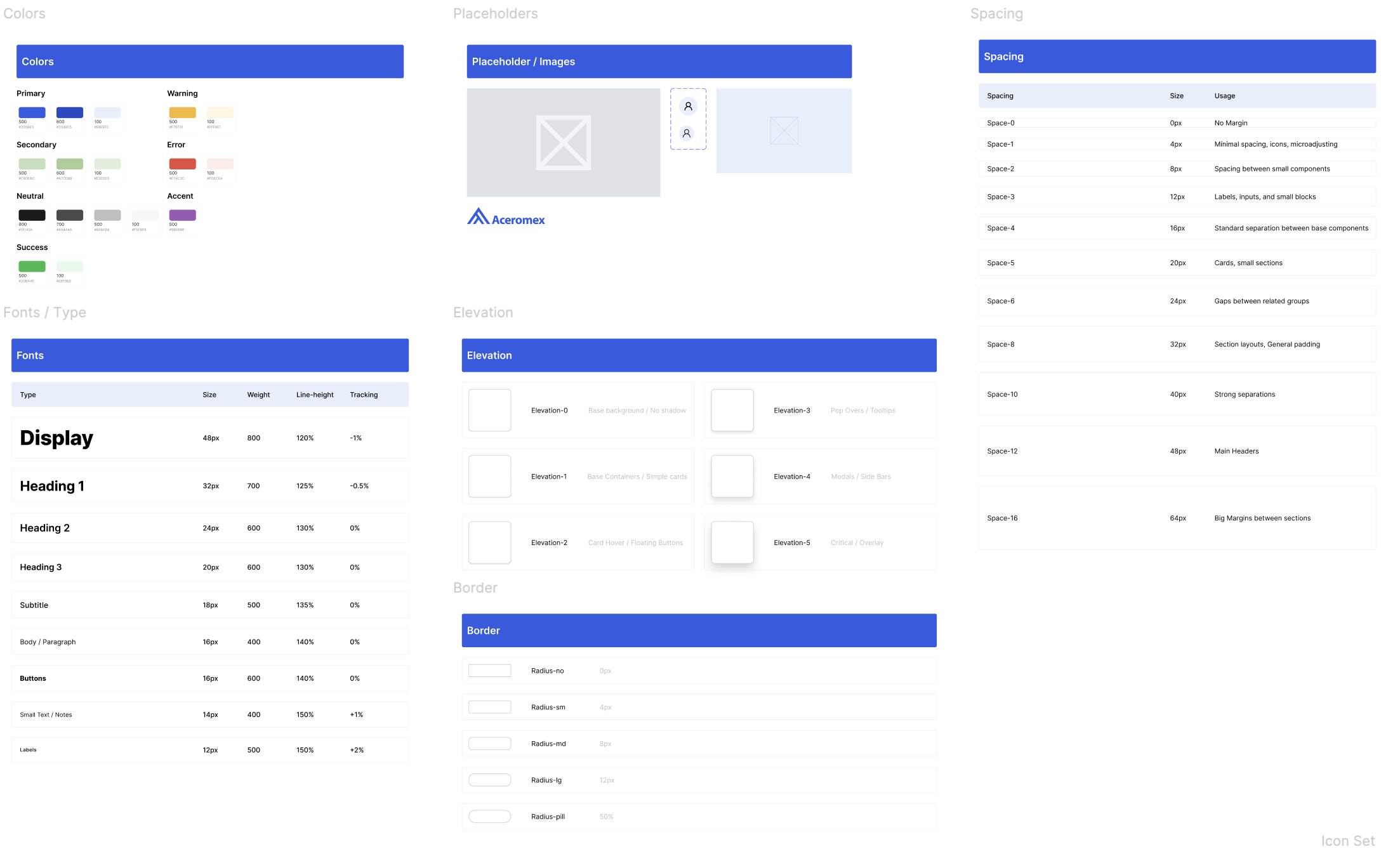
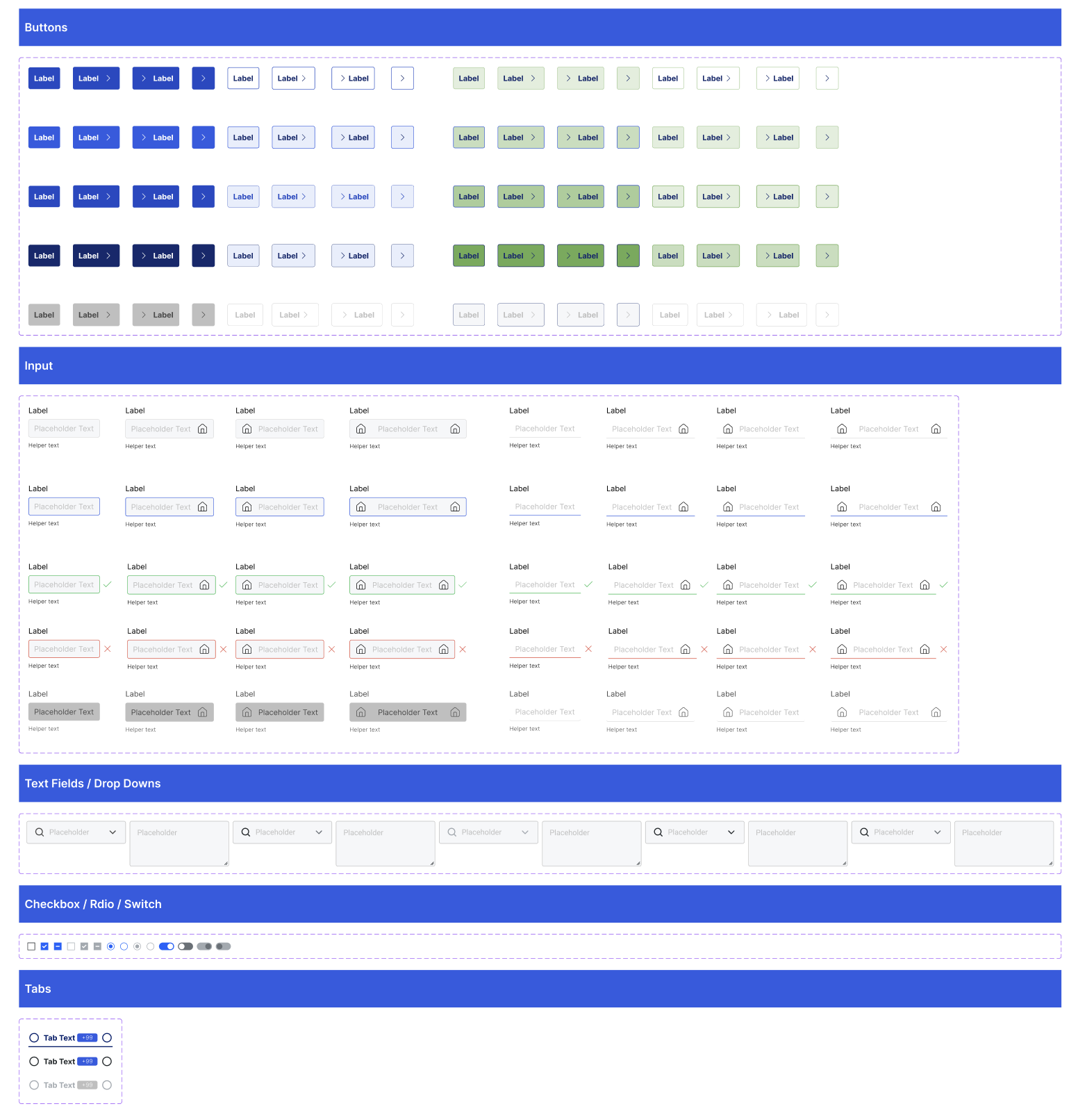
Designing the elements
Since I had a clear list of components to build, I started with the simplest elements and worked my way up to more complex compositions. The first step was to define and standardize the design tokens to ensure consistency across the system.
My first approach was to start building directly from the audit and component list I had created. I kept the visuals clean and uncluttered, as the client emphasized the need for a clear, simple interface aligned with their new brand identity. However, as I progressed, I realized the initial list wasn’t complete. Some states, variations, and elements were missing and had to be added along the way.
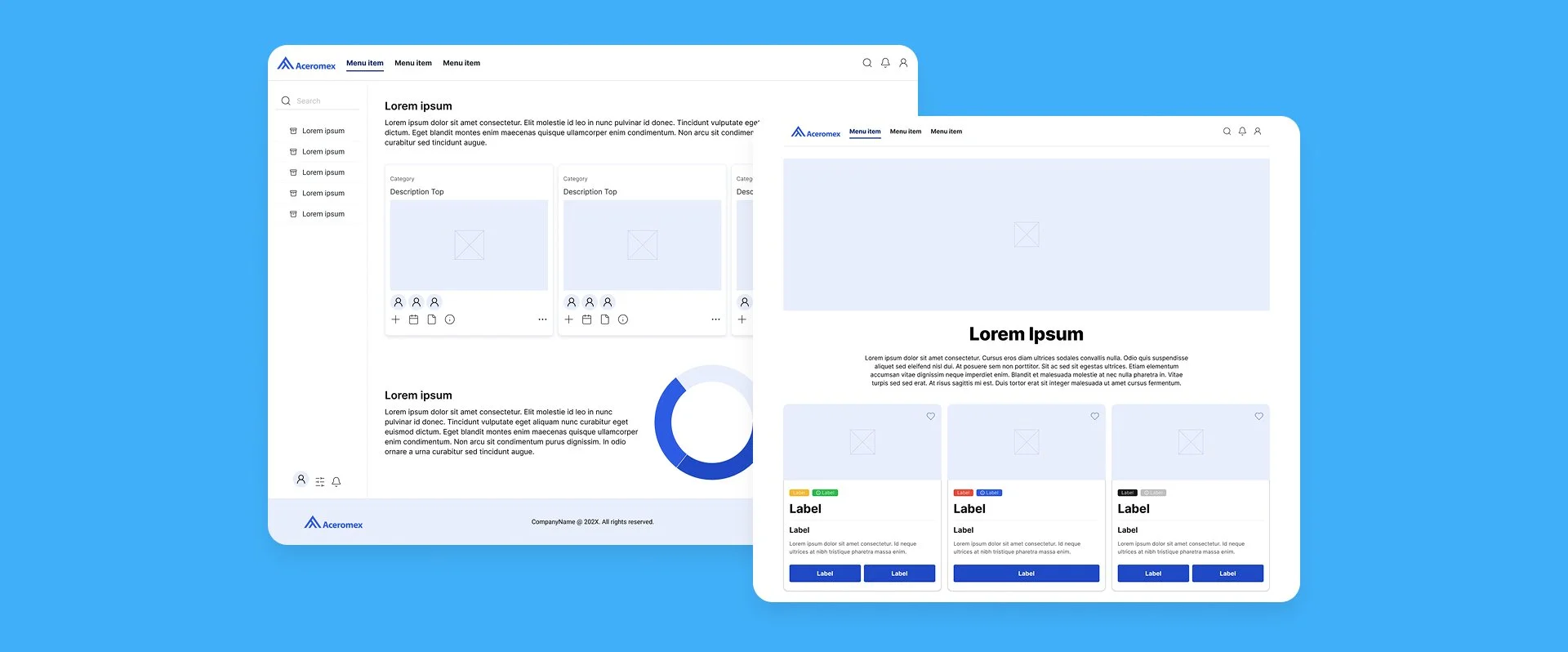
The components were designed with simplicity in mind, clean shapes, clear labels, and plenty of space to keep everything easy to read. A bold blue is used across the system to create consistency and guide attention. The result is a clean, flexible set of elements ready to work across their platforms.
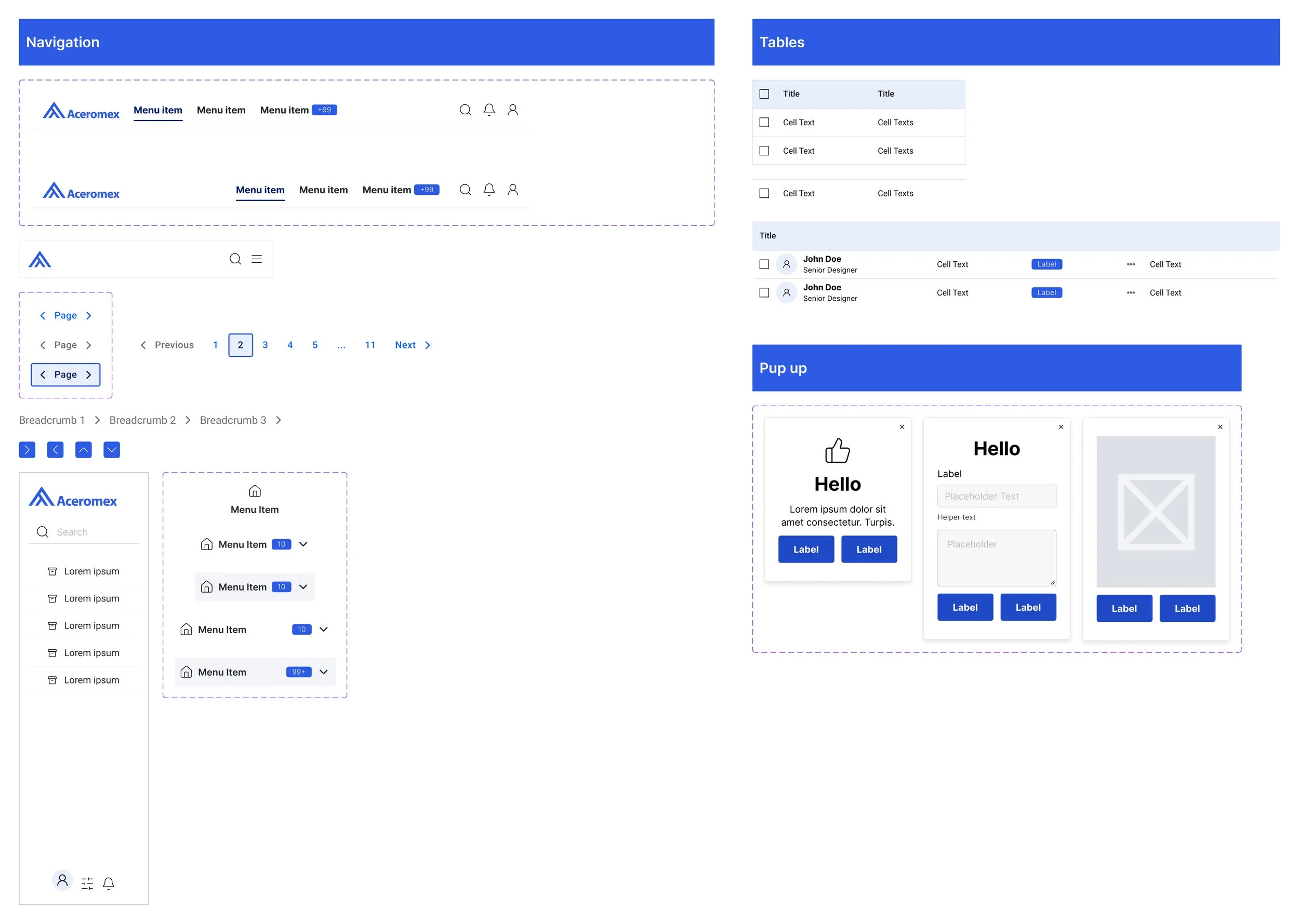
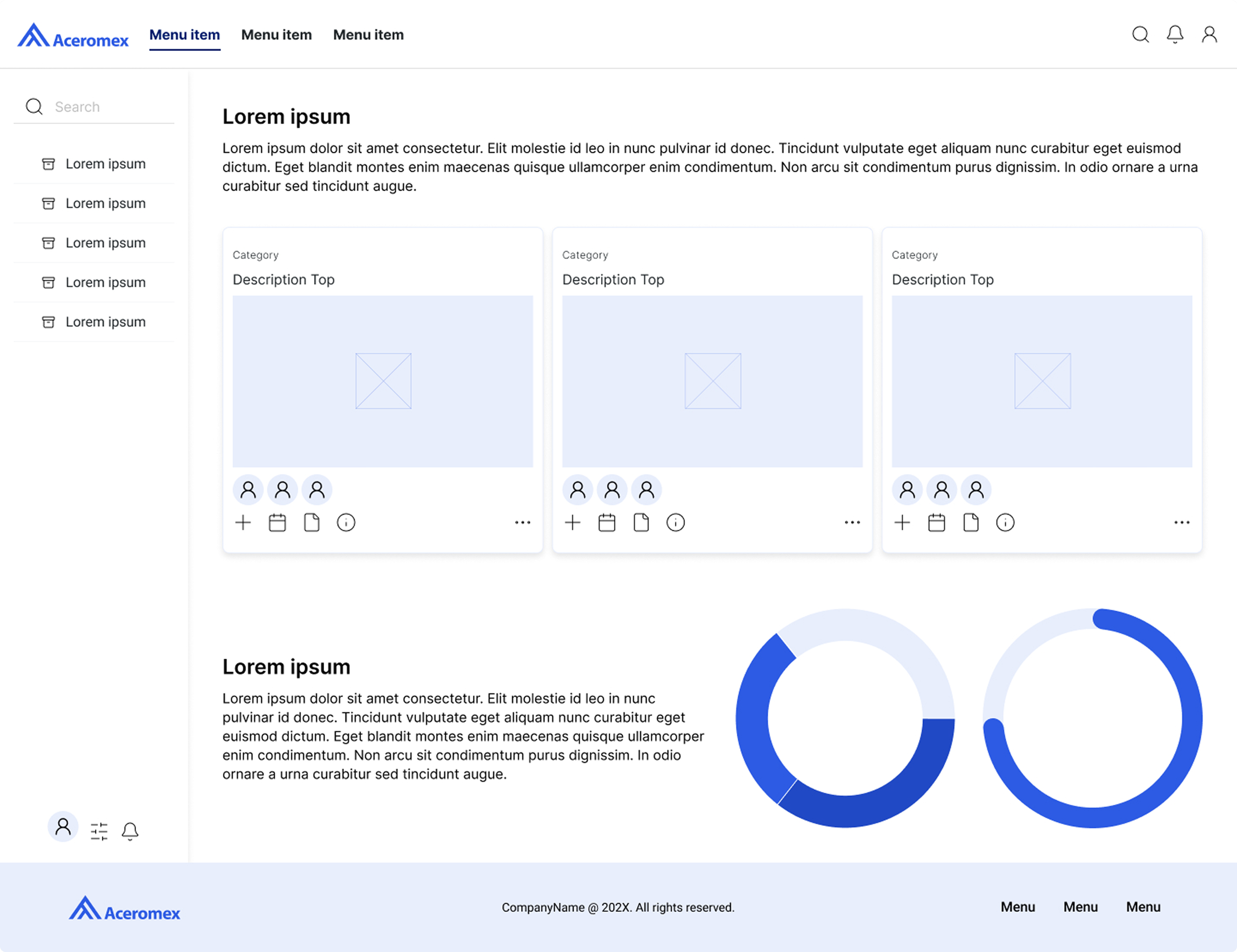
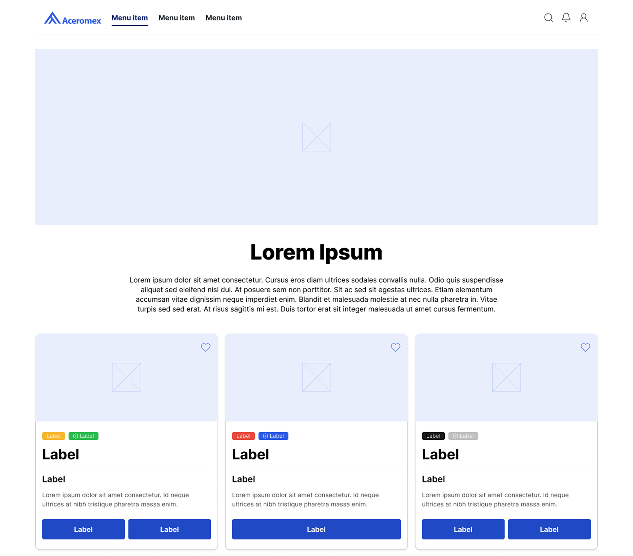
Once I had the first stage of the components, I decided to make some screen examples to see how the overall look and feel of the system worked, and reviewed this with the client. After this we will continue with the rest of the components needed for the full system.
Take aways & Next steps
Creating a first phase of the design system for this client helped me to understand the full scope, effort, and processes involved.
Learned that leveraging established systems like Material Design can significantly speed up production and improve efficiency.
I realized that properly analyzing all requirements before starting ensures time savings, reduces rework, and guarantees full project scope coverage.
A well-planned design system supports scalability, consistency, and faster handoffs across teams.
Overall, the client was happy with this stage because it works on a basic level, but we will keep on developing more components needed to fully cover the user’s needs.